Transform Your Space: The Psychology of Paint Colors in Your Home

The psychology of home paint colors plays a powerful role in shaping how your space feels and functions. Color is more than an aesthetic choice—it affects your mood, energy, and even how productive or relaxed you feel. If you're planning an interior painting project in San Luis Obispo or anywhere on the Central Coast, it's worth exploring how color can support your lifestyle and well-being.
Every color tells a story. Soft blues can create calm, warm earth tones offer comfort, and bright yellows lift your mood. Whether you're updating a bedroom, home office, or living area, the colors you choose send signals to your brain that can influence your emotions and behavior. Thoughtful color choices can transform the atmosphere of your home without changing anything else.
In this article, we'll explore how different paint colors affect your mood, which tones work best for specific rooms, and how to use color psychology to create balance, energy, or calm throughout your space. You'll also discover current color trends on the Central Coast and tips for working with a professional painting team to bring your vision to life.
Ready to rethink the color of your walls? The right paint color can transform your house into a space that supports and inspires you every day.
What is Color Psychology in Home Design?
Color psychology in home design is the practice of using color to influence mood, behavior, and energy within a space. It's based on the idea that certain colors can create specific emotional responses. For example, cool tones like blue and green often promote calm, while warm tones like red and orange create a sense of warmth or excitement. By applying this knowledge to interior painting, homeowners can create intentional and supportive spaces.
Every room has a purpose. Choose paint colors that support that function. Crisp whites or soft aquas make bathrooms feel cleaner. Warm neutrals or olive greens make kitchens cozy. Welcome tones like soft gold or terracotta benefit entryways. Function and feeling go hand in hand when it comes to color.
When you step into a room, the colors around you begin working immediately—whether you realize it or not. They can make a room feel larger or smaller, brighter or cozier, stimulating, or restful. That's why paint isn't just about looks. It's about how you want to feel when you're living in that room daily. The right color can ease anxiety, boost creativity, or encourage connection.
Homeowners in San Luis Obispo and along the Central Coast are increasingly turning to color psychology to enhance their daily lives. This approach is beneficial for multipurpose homes, where a space might need to support work, rest, and play. With thoughtful color planning, you can create visual boundaries and emotional cues that help each room serve its purpose more effectively.
Start by thinking about how you want each room to feel. Energized? Peaceful? Balanced? Once you identify the goal, select a color that supports it. Use soft tones in spaces for rest and bright tones in places for work or activity. You don't have to repaint your entire home to benefit from color psychology. Even one wall or trim color change can make a big difference.
Understanding the basics of color psychology gives you more control over your home environment. It's a practical way to make your house more beautiful, functional, and emotionally balanced.
How Do Paint Colors Affect Mood?

Paint colors affect mood by triggering emotional and psychological responses. The psychology behind color has been studied for decades, and its effects are especially noticeable in the spaces where we live. The colors on your walls aren't just background—they help shape your daily experience at home.
Warm colors like red, orange, and yellow stimulate the senses and are ideal for creating a lively, welcoming atmosphere. Red can add passion and intensity, while orange brings a sense of enthusiasm. Yellow is linked to happiness and optimism. These tones work well in areas where energy and interaction are encouraged, such as kitchens or dining rooms.
Cool colors like blue, green, and lavender create a calming effect. These hues are often used in bedrooms, bathrooms, and quiet corners of the home. Blue promotes peace and mental clarity. Green connects us to nature and symbolizes renewal. Lavender brings softness and helps reduce stress. These shades help slow down the pace and support rest and reflection.
Neutrals like white, beige, gray, and greige provide balance and versatility. They offer a clean backdrop that complements a wide range of design styles. Neutral tones can also be a canvas for bold accents, allowing you to introduce mood-enhancing colors in smaller doses. How a color feels also depends on the light in the room, the surrounding furniture, and even the time of day. That's why it's helpful to test a color on your wall before deciding.
Choosing the right mood for each space starts with understanding how colors work. Whether you want to energize a room or create a sanctuary, the right paint color helps you achieve it.
Warm vs Cool Paint Tones
Understanding the difference between warm and cool tones is essential. Warm tones include reds, oranges, and yellows; they make rooms feel cozier and more intimate and are often used in small rooms to create an inviting atmosphere. Cool tones like blues and greens open up a space, making it feel larger; they are ideal for large rooms to maintain airiness or for small rooms to create a sense of spaciousness.
Coastal-Inspired Color Palettes
Living on the Central Coast offers natural inspiration. Think of soft seafoam greens, driftwood grays, sandy taupes, and ocean blues. These colors reflect the beach, ocean, and sky, bringing a sense of ease and freshness. They're perfect for homes in San Luis Obispo, where natural beauty is a key part of daily life.
Central Coast Home Color Trends
Current trends on the Central Coast favor simplicity and connection to nature. Homeowners are leaning into soft, natural palettes. Creamy whites, warm greige, dusty blues, and olive greens are popular. These colors reflect the relaxed lifestyle and coastal environment. They also provide a timeless backdrop that won't go out of style quickly.
Choosing Calming Paint Tones for Serenity
Opt for soft, muted tones if you want your home to feel peaceful. Pale blues, gentle greens, soft grays, and warm creams all help reduce stress. These colors work well in bedrooms, living rooms, and reading nooks—anywhere you want to unwind. Natural light enhances the calming effect, so choose lighter tones in sunlit spaces.
Relaxing Paint Colors for Living Rooms
Living rooms often serve as gathering places. Soft earth tones or warm neutrals work well to make them welcoming and calm. Think sandy beige, warm taupe, or dusty sage. These colors support relaxation and conversation and pair well with wooden furniture and coastal-inspired accents.
Best Paint Colors for Bedrooms
In bedrooms, rest is the priority. Shades of blue are a classic choice. Light blues encourage sleep and tranquility. Soft lavenders or muted greens can also create a restful atmosphere. Avoid bright reds or bold oranges here—they may be too energizing for sleep spaces.
Best Colors for Relaxation Spaces
Your home should have areas where you can fully relax. This could be a meditation room, a quiet corner for reading, or even your bathroom. Soft green, light lavender, pale pink, and warm gray promote relaxation. Use natural materials like wood and cotton to complement these tones for a more grounded, calming effect.
Productive Paint Hues for Workspaces and Home Offices

Your home office needs a different type of energy than what is needed for the rest of the house. To stay focused and alert, choose colors that support productivity. Soft greens can help with concentration. Light yellow adds optimism. Pale blue supports clear thinking. Steer clear of dull, dark colors that may drain your motivation.
If your job requires creativity or communication, you might want more vibrant hues. Coral, teal, or even bold mustard can energize your mind. These colors can wake up a space without overwhelming it. Use them on one wall or as accents to keep your workspace lively.
Transform Your Home with the Right Colors and Browder Painting
While DIY projects can be fun, working with a professional painting company ensures the best results. Experienced painters understand how light, surface texture and finish affect a color's appearance. They can help you choose the right tones, apply them flawlessly, and ensure your space looks its best. Homeowners in San Luis Obispo and across the Central Coast choose professional interior painters from Browder Painting Company to bring their vision to life.
Your home is more than a place to live. It's where you rest, work, dream, and connect. The right paint colors support your lifestyle by enhancing mood and boosting function. Whether drawn to calming tones or bold accents, the right color can completely transform your space.
Paint is one of the simplest, most affordable ways to change the look and feel of your home. With the right guidance, it can also be one of the most powerful.
Get a quote today and bring the psychology of color into your home.
Our Recent Articles
-
Transform Your Space: The Psychology of Paint Colors in Your Home
The psychology of home paint colors plays a powerful role in shaping how your space feels and functions. Color is more than an aesthetic choice—it affects your mood, energy, and even how productive or relaxed you feel. If you're planning an interior painting project in San […]
-
Why California Coastal Homes Need Regular Repainting: The Effects of Sun, Wind, and Salt
California's central coast offers spectacular ocean views, a laid-back lifestyle, and many natural attractions. When you invest in a beach-front property, you'll notice the effects of salt air on home paint, high humidity, and sun damage your house paint within just a couple of years. Like […]
-
How to Protect Your Landscaping During Exterior Painting
A fresh coat of paint can completely transform the look of your home and protect the exterior from the elements. However, while the focus is often on choosing the right color and finish, it’s just as important to consider the impact of house painting on your […]
Our Latest Projects
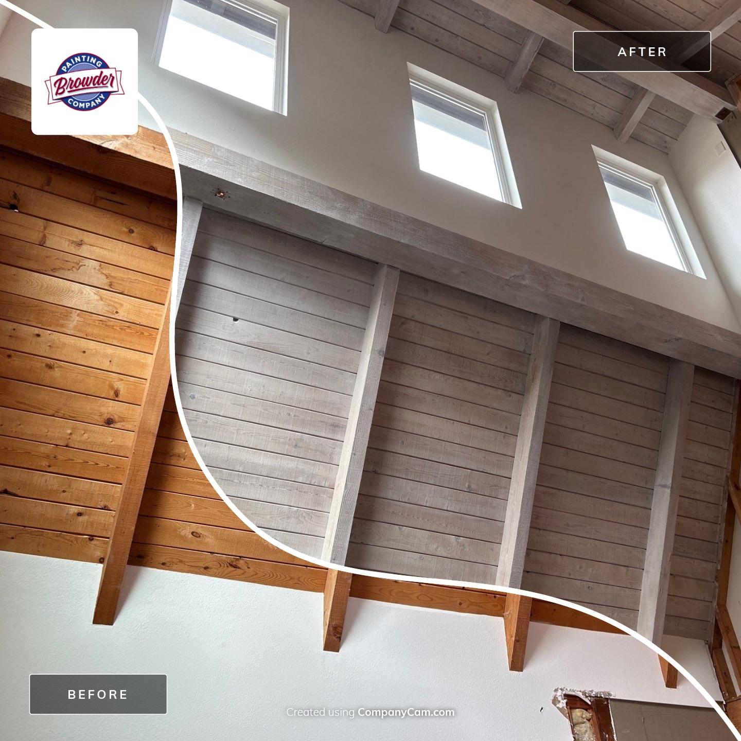
At Browder Painting, a trusted residential painting company serving San Luis Obispo County, we specialize in creating beautiful, custom interiors that enhance the charm and character of your home. Recently, we had the pleasure of completing a unique interior ceiling transformation for a client in Los […]
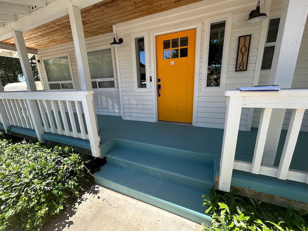
Goal: Durable Sun Protection for a Repeat Client On this residential deck project in Paso Robles, the homeowner needed a more durable solution to protect the deck from the region’s intense sun exposure. The original semi-transparent stain was not holding up, and they were looking for a […]
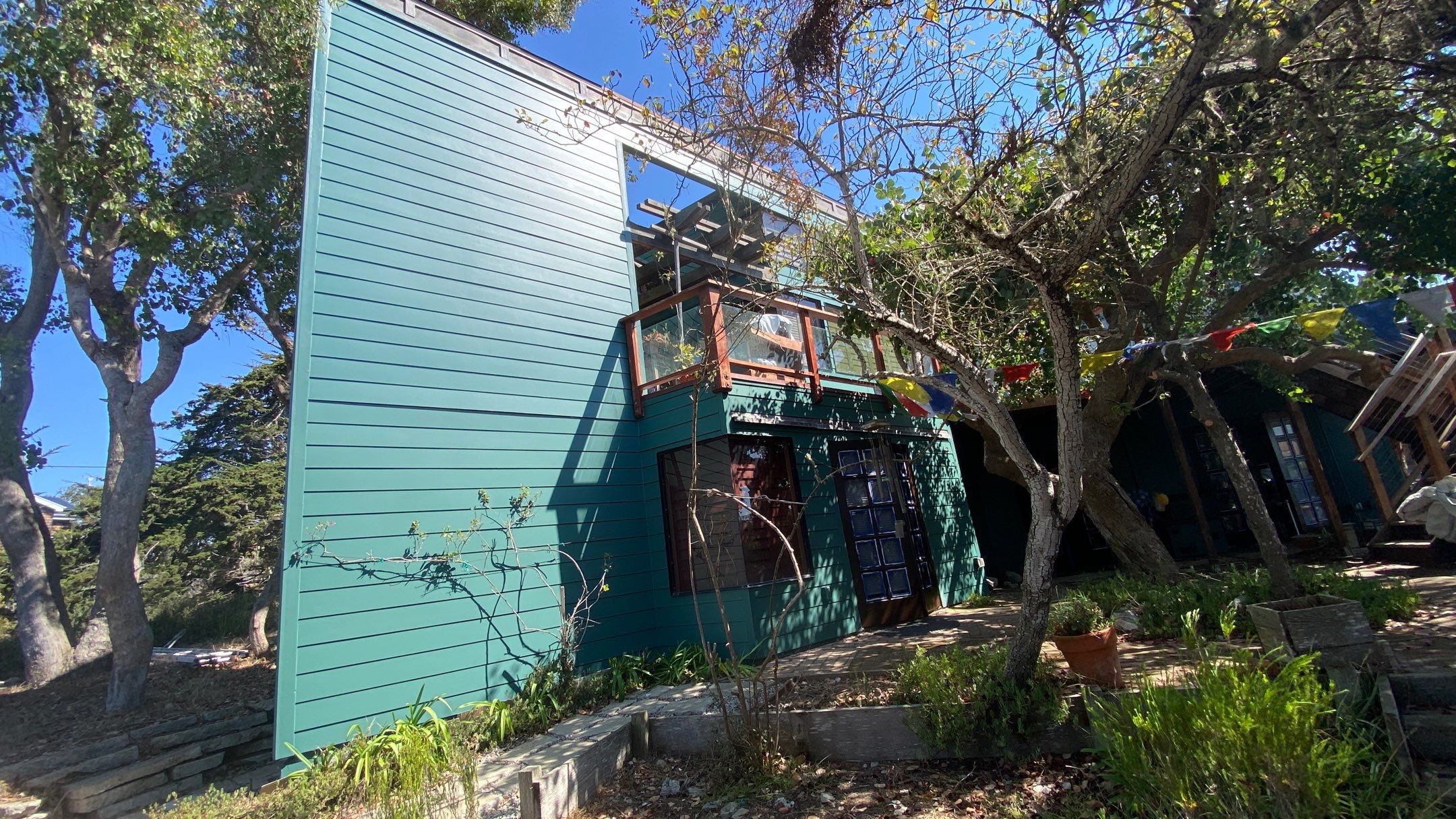
Project Spotlight: Stunning Transformation of a Cal Poly-Designed Home in Los Osos, CA At Browder Painting, we specialize in residential painting projects that require both precision and an eye for detail. Recently, we completed a stunning exterior painting project on a Cal Poly-designed home in Los Osos, […]